Barlow
About Barlow
- Source
- Google Fonts ↗
- Classification
- sans-serif
- Weights
- 100, 200, 300, 400, 500, 600, 700, 800, 900
- Features
- Italics
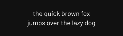
Barlow is a grotesk sans-serif typeface designed by Jeremy Tribby and released in 2017. Inspired by the visual style of California's public infrastructure and signage, it captures the utilitarian beauty of highway signs and industrial design.
History and Design
Jeremy Tribby designed Barlow as a tribute to the visual language of California—specifically the signage of the state's highway system and the functional aesthetics of its infrastructure. The typeface takes its name from Barlow Road, part of the original Oregon Trail.
Barlow's design features condensed proportions, a slightly high waist, and the squared-off curves typical of signage typefaces. The family includes regular, semi-condensed, and condensed widths, making it exceptionally versatile for space-constrained applications.
Why Barlow Works
Barlow succeeds because it combines the efficiency of a condensed gothic with warmth and personality. Unlike purely mechanical grotesques, Barlow has subtle humanist touches that prevent it from feeling cold. Its California-inspired design gives it an optimistic, forward-looking character.
The typeface has been adopted by technology companies, transportation systems, and brands seeking an industrial aesthetic without sacrificing approachability.
Technical Features
- Multiple widths: Regular, Semi-Condensed, and Condensed variants
- Complete weight range: Thin (100) through Black (900)
- Full italic family: All weights available in italic
- Extended Latin support: Western European and Vietnamese
Best Use Cases
Barlow excels in:
- Wayfinding and signage: Designed with signage DNA
- Data visualization: Condensed widths save space in charts and tables
- Technology products: Modern industrial aesthetic
- Packaging: Efficient use of limited label space
Usage Tips
Use Barlow Condensed when space is at a premium—it maintains readability while fitting more content. For body text, the regular width at weight 400-500 provides comfortable reading. Barlow pairs well with geometric serifs or other sans-serifs with contrasting proportions. Consider using different widths for hierarchy: condensed for navigation, regular for content.
Alternative For (2)
Barlow is a free alternative to the following premium fonts:
Condensed proportions with comparable utilitarian aesthetic
How to Use Barlow
Copy these code snippets to quickly add Barlow to your project.
CSS Import
@import url('https://fonts.googleapis.com/css2?family=Barlow:wght@100;200;300;400;500;600;700;800;900&display=swap');HTML Link Tags
<link rel="preconnect" href="https://fonts.googleapis.com">
<link rel="preconnect" href="https://fonts.gstatic.com" crossorigin>
<link href="https://fonts.googleapis.com/css2?family=Barlow:wght@100;200;300;400;500;600;700;800;900&display=swap" rel="stylesheet">
Tailwind CSS
// tailwind.config.js
module.exports = {
  theme: {
    extend: {
      fontFamily: {
        'barlow': ['Barlow', 'sans-serif'],
      },
    },
  },
}

// Usage in HTML:
// <p class="font-barlow">Your text here</p>
React / Next.js
// Using next/font (Next.js 13+)
import { Barlow } from 'next/font/google';

const barlow = Barlow({
  subsets: ['latin'],
  weight: ['100', '200', '300', '400', '500', '600', '700', '800', '900'],
});

export default function Component() {
  return (
    <p className={barlow.className}>
      Your text here
    </p>
  );
}

// Or using inline styles with Google Fonts link:
// <p style={{ fontFamily: "'Barlow'" }}>Your text</p>