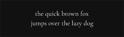
Cormorant Garamond
About Cormorant Garamond
- Source
- Google Fonts ↗
- Classification
- serif
- Weights
- 300, 400, 500, 600, 700
- Features
- Italics
Cormorant Garamond is a display typeface designed by Christian Thalmann that draws inspiration from Claude Garamont's 16th-century designs while adding contemporary flair. With higher contrast and more dramatic proportions than traditional Garamond revivals, it excels in headlines and large-format applications.
History and Design
Christian Thalmann designed Cormorant as a project on Kickstarter, describing it as "a display type family in the Garamond tradition." Rather than creating a faithful historical revival, Thalmann interpreted the Garamond aesthetic with increased contrast and refined details suited to modern display use.
The Cormorant family includes several variants: Garamond, Infant (with simpler letterforms), Upright (italicized forms as the regular style), and SC (small caps). This flexibility makes it adaptable to diverse design needs.
Why Cormorant Garamond Excels
Cormorant Garamond's higher contrast creates visual drama that works beautifully at large sizes. The refined details and elegant proportions convey sophistication while maintaining readability. It bridges the gap between classical Garamond and contemporary display typography.
Technical Features
- Five weights: Light through bold with matching italics
- Multiple family variants: Garamond, Infant, Upright, SC
- Extensive character set: Latin Extended, Cyrillic, Vietnamese
- OpenType features: Ligatures, stylistic alternates, small caps
- Display optimized: High contrast for headlines and large text
Best Use Cases
Cormorant Garamond excels in:
- Display typography: Headlines, titles, and pull quotes
- Editorial design: Magazine features and article headers
- Branding: Elegant logotypes and visual identities
- Wedding and event stationery: Romantic, refined aesthetic
Usage Tips
Reserve Cormorant Garamond for display sizes (18pt and above) where its high contrast shines. For body text, pair it with EB Garamond or another text-optimized serif. The light weight creates especially striking headlines. Use the Infant variant for a slightly softer, more approachable feel in children's content or friendly branding.
Alternative For (1)
Cormorant Garamond is a free alternative to the following premium fonts:
How to Use Cormorant Garamond
Copy these code snippets to quickly add Cormorant Garamond to your project.
CSS Import
@import url('https://fonts.googleapis.com/css2?family=Cormorant+Garamond:wght@300;400;500;600;700&display=swap');HTML Link Tags
<link rel="preconnect" href="https://fonts.googleapis.com">
<link rel="preconnect" href="https://fonts.gstatic.com" crossorigin>
<link href="https://fonts.googleapis.com/css2?family=Cormorant+Garamond:wght@300;400;500;600;700&display=swap" rel="stylesheet">
Tailwind CSS
// tailwind.config.js
module.exports = {
  theme: {
    extend: {
      fontFamily: {
        'cormorant-garamond': ['"Cormorant Garamond"', 'sans-serif'],
      },
    },
  },
}

// Usage in HTML:
// <p class="font-cormorant-garamond">Your text here</p>
React / Next.js
// Using next/font (Next.js 13+)
import { Cormorant_Garamond } from 'next/font/google';

const cormorant_garamond = Cormorant_Garamond({
  subsets: ['latin'],
  weight: ['300', '400', '500', '600', '700'],
});

export default function Component() {
  return (
    <p className={cormorant_garamond.className}>
      Your text here
    </p>
  );
}

// Or using inline styles with Google Fonts link:
// <p style={{ fontFamily: '"Cormorant Garamond"' }}>Your text</p>