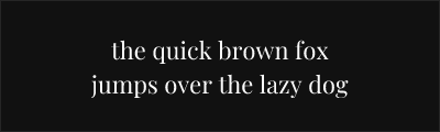
Playfair Display
About Playfair Display
- Source
- Google Fonts ↗
- Classification
- serif
- Weights
- Variable (100-900)
- Features
- Variable, Italics
Playfair Display is a transitional display typeface designed by Claus Eggers Sørensen. Inspired by the letterforms of John Baskerville, the Scotch Roman typefaces, and the work of Didot and Bodoni, it brings the elegant high-contrast aesthetic of 18th-century printing into the digital age.
History and Design
Claus Eggers Sørensen designed Playfair Display in 2011, creating a typeface that references the refined letterforms emerging when quills gave way to pointed steel pens. The design captures the period's characteristic high contrast while incorporating subtle refinements for contemporary screen display.
Playfair borrows from multiple traditions: the transitional grace of Baskerville, the dramatic contrast of Didot and Bodoni, and the robust practicality of Scotch Roman. This synthesis creates a versatile display face suitable for diverse applications.
Why Playfair Display Succeeds
Playfair Display achieves remarkable elegance without sacrificing usability. Its slightly heavier hairlines and subtle bracketing improve screen rendering compared to pure Didone typefaces. The result feels both classical and contemporary—sophisticated without being cold.
Technical Features
- Variable font: Full weight range from regular to black
- True italics: Distinct italic designs for all weights
- Small caps variant: Playfair Display SC available separately
- Extended character support: Latin, Cyrillic, Vietnamese
- OpenType features: Ligatures, stylistic alternates, fractions
Best Use Cases
Playfair Display excels in:
- Editorial design: Magazine headlines and feature titles
- Fashion and lifestyle: Elegant, aspirational aesthetics
- Wedding stationery: Romantic, refined invitations
- Restaurant and hospitality: Upscale menu design and branding
Usage Tips
Playfair Display performs best at 18pt and above. For body text, pair with neutral sans-serifs like Source Sans Pro or Lato. The black weight creates especially dramatic headlines. Use the small caps variant (Playfair Display SC) for subheadings and running heads. Enable ligatures for refined typography, especially the fl and fi combinations.
Alternative For (2)
Playfair Display is a free alternative to the following premium fonts:
Contemporary interpretation with similar dramatic contrast for display use
How to Use Playfair Display
Copy these code snippets to quickly add Playfair Display to your project.
CSS Import
@import url('https://fonts.googleapis.com/css2?family=Playfair+Display:wght@100..900&display=swap');HTML Link Tags
<link rel="preconnect" href="https://fonts.googleapis.com">
<link rel="preconnect" href="https://fonts.gstatic.com" crossorigin>
<link href="https://fonts.googleapis.com/css2?family=Playfair+Display:wght@100..900&display=swap" rel="stylesheet">
Tailwind CSS
// tailwind.config.js
module.exports = {
  theme: {
    extend: {
      fontFamily: {
        'playfair-display': ['"Playfair Display"', 'sans-serif'],
      },
    },
  },
}

// Usage in HTML:
// <p class="font-playfair-display">Your text here</p>
React / Next.js
// Using next/font (Next.js 13+)
import { Playfair_Display } from 'next/font/google';

const playfair_display = Playfair_Display({
  subsets: ['latin'],
  weight: ['100', '200', '300', '400', '500', '600', '700', '800', '900'],
});

export default function Component() {
  return (
    <p className={playfair_display.className}>
      Your text here
    </p>
  );
}

// Or using inline styles with Google Fonts link:
// <p style={{ fontFamily: '"Playfair Display"' }}>Your text</p>