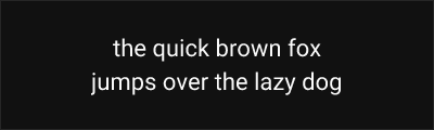
Roboto
About Roboto
- Source
- Google Fonts ↗
- Classification
- sans-serif
- Weights
- Variable (100-900)
- Features
- Variable, Italics
Roboto is a neo-grotesque sans-serif typeface designed by Christian Robertson and released by Google in 2011 as the system font for Android. It has become one of the most widely used typefaces on the web and mobile platforms.
History and Design
Christian Robertson designed Roboto for Google's Android 4.0 (Ice Cream Sandwich) release. The initial version drew criticism for inconsistency between letterforms, leading to a significant redesign in 2014 that created the harmonious typeface used today. The redesigned Roboto features a more natural, rounded character while maintaining the mechanical precision expected of a neo-grotesque.
Roboto occupies an interesting position in type classification—Robertson described it as having a "dual nature" with geometric forms and open curves typically associated with humanist typefaces.
Why Roboto is Popular
As Android's system font and a cornerstone of Google's Material Design, Roboto has achieved unprecedented distribution. Its neutral character, extensive language support, and free availability have made it a go-to choice for digital products worldwide. The Roboto family has expanded to include condensed widths, a slab serif variant (Roboto Slab), and a monospace version (Roboto Mono).
Technical Features
- Variable font: Weight axis from Thin (100) to Black (900)
- Comprehensive family: Regular, Condensed, Slab, and Mono variants
- Extensive language support: Latin, Cyrillic, Greek, Vietnamese
- OpenType features: Tabular figures, fractions, superscripts, subscripts
Best Use Cases
Roboto excels in:
- Android applications: Native look consistent with system UI
- Material Design projects: Official pairing with Material components
- Web applications: Excellent screen rendering at all sizes
- Cross-platform products: Familiar and neutral across devices
Usage Tips
For body text, use Roboto Regular (400) with weight 500 for emphasis. Enable tabular figures for data tables and financial information. Consider Roboto Flex for more granular control over weight and width. Pairs well with Roboto Slab for headings or Roboto Mono for code blocks in technical documentation.
Alternative For (3)
Roboto is a free alternative to the following premium fonts:
Similar functional design philosophy optimized for digital interfaces
Similar industrial character with contemporary refinements
How to Use Roboto
Copy these code snippets to quickly add Roboto to your project.
CSS Import
@import url('https://fonts.googleapis.com/css2?family=Roboto:wght@100..900&display=swap');HTML Link Tags
<link rel="preconnect" href="https://fonts.googleapis.com">
<link rel="preconnect" href="https://fonts.gstatic.com" crossorigin>
<link href="https://fonts.googleapis.com/css2?family=Roboto:wght@100..900&display=swap" rel="stylesheet">
Tailwind CSS
// tailwind.config.js
module.exports = {
  theme: {
    extend: {
      fontFamily: {
        'roboto': ['Roboto', 'sans-serif'],
      },
    },
  },
}

// Usage in HTML:
// <p class="font-roboto">Your text here</p>
React / Next.js
// Using next/font (Next.js 13+)
import { Roboto } from 'next/font/google';

const roboto = Roboto({
  subsets: ['latin'],
  weight: ['100', '200', '300', '400', '500', '600', '700', '800', '900'],
});

export default function Component() {
  return (
    <p className={roboto.className}>
      Your text here
    </p>
  );
}

// Or using inline styles with Google Fonts link:
// <p style={{ fontFamily: "'Roboto'" }}>Your text</p>