Rokkitt
About Rokkitt
- Source
- Google Fonts ↗
- Classification
- serif
- Weights
- Variable (100-900)
- Features
- Variable, Italics
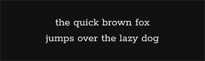
Rokkitt is a geometric slab serif typeface designed by Vernon Adams and later expanded by other contributors. Originally released in 2011, it combines friendly proportions with clean geometric construction, offering comprehensive weight coverage and a variable font option.
History and Design
Vernon Adams designed the original Rokkitt as part of his prolific contributions to Google Fonts. The design features friendly, open letterforms with geometric foundations—circles and straight lines form the structural basis, softened by rounded terminals and generous spacing.
The typeface was later expanded by other designers to include additional weights and a variable font version, creating a comprehensive family suitable for both display and text use.
Why Rokkitt Excels
Rokkitt bridges the gap between utilitarian geometric slabs and warmer, personality-driven designs. Its friendly proportions prevent the cold, industrial feeling of pure geometric slabs, while its clean construction maintains professionalism and versatility.
Technical Features
- Variable font: Full weight axis from Thin to Black
- Nine static weights: Comprehensive hierarchy options
- True italics: Matching italic for all weights
- Geometric construction: Clean, sturdy foundations
- Extended Latin: Good character coverage
Best Use Cases
Rokkitt excels in:
- Web headlines: Friendly, attention-grabbing titles
- Tech branding: Modern, approachable identity
- Editorial design: Distinctive but readable headers
- UI design: Navigation and interface elements
Usage Tips
Rokkitt's comprehensive weight range enables nuanced typographic hierarchy—use lighter weights (200-300) for elegant headlines, Regular-Medium (400-500) for emphasis, and Bold (700) for strong statements. The variable font allows precise weight matching across breakpoints for responsive design. Pair with geometric sans-serifs like Nunito Sans or Montserrat, or humanist designs like Open Sans for warm, readable layouts.
Alternative For (1)
Rokkitt is a free alternative to the following premium fonts:
Clean geometric slab with friendly proportions and multiple weights
How to Use Rokkitt
Copy these code snippets to quickly add Rokkitt to your project.
CSS Import
@import url('https://fonts.googleapis.com/css2?family=Rokkitt:wght@100..900&display=swap');HTML Link Tags
<link rel="preconnect" href="https://fonts.googleapis.com">
<link rel="preconnect" href="https://fonts.gstatic.com" crossorigin>
<link href="https://fonts.googleapis.com/css2?family=Rokkitt:wght@100..900&display=swap" rel="stylesheet">
Tailwind CSS
// tailwind.config.js
module.exports = {
  theme: {
    extend: {
      fontFamily: {
        'rokkitt': ['Rokkitt', 'sans-serif'],
      },
    },
  },
}

// Usage in HTML:
// <p class="font-rokkitt">Your text here</p>
React / Next.js
// Using next/font (Next.js 13+)
import { Rokkitt } from 'next/font/google';

const rokkitt = Rokkitt({
  subsets: ['latin'],
  weight: ['100', '200', '300', '400', '500', '600', '700', '800', '900'],
});

export default function Component() {
  return (
    <p className={rokkitt.className}>
      Your text here
    </p>
  );
}

// Or using inline styles with Google Fonts link:
// <p style={{ fontFamily: "'Rokkitt'" }}>Your text</p>